Chart Control
- Chart Style
- Chart Type
- 3d Appearance
- Effects
- Data Source
- Source
- Table
- Connection
- Select Statement
- Use Portable SQL
- Arguments
- Argument Bindings
- Filter records
- Custom Source
- Custom Watch
- Chart Series
- Series Type
- Series
- Series Expression
- Series Label Expression
- Plot Series on Axis
- Chart Data
- Summarization
- Data
- Data Columns
- Sample unique
- Sample at
- Sample Over
- Data Label
- Explode slice
- Chart Category
- Category
- Category Label
- Chart Settings
- Chart Title
- X Axis Title
- Y Axis Title
- Data Label Placement
- Include Zero
- Show Breaks
- Chart Style
- Chart Style
- Events
- Event Handler
- Videos
- Layout Editors - Embedded Charts
- Charts - Xdialog Examples
- Forms - Embedded Charts - Charting Summary Data
Description
The Chart Control is used by several other components and subsystems: the Web Chart Component, Reports, the Chart Alternate View, and desktop Forms. This article explains the common functionality provided by the Chart Control Genie. Charting is built into the Dialog Component (called the UX component in V12 and above) and into Reports.
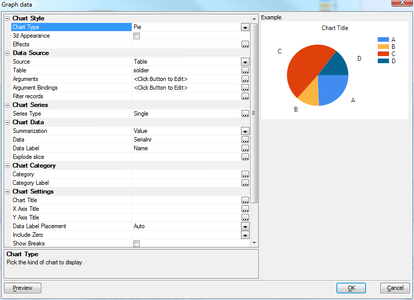
The screen shot above shows the default chart setup dialog; this particular one was brought up from the desktop Form Designer. The table below lists all the controls that can appear on the Chart property sheet, and describes each one's usage.
Chart Style
Chart Type
Bar Vertical Grouped, Bar Vertical Stacked, Bar Vertical Overlaid, Bar Horizontal Grouped, Bar Horizontal Stacked, Line, Area, Spline, SplineArea, StackedArea, Radar, Pie, Doughnut, Funnel, Pyramid, Stock, Candlestick, Bubble.
3d Appearance
Use three-dimension effects?
Effects
Other chart effects; what is offered depends on the chart type and 3d setting. Possible options are None, Concave, SoftEdge, Circle, Polygon, Line, Marker, Area, Circular Base, Square Base, Cylinder, Emboss, Light To Dark, Wedge
Data Source
Source
Table, SQL, Custom, or (in the context of a report) Report
Table
Table or Set name, only offered if Source is Table
Connection
SQL connection, only offered if Source is SQL
Select Statement
SQL select statement, only offered if Source is SQL
Use Portable SQL
Portable or native SQL syntax, only offered if Source is SQL
Arguments
Not offered if Source is Report
Argument Bindings
Not offered if Source is Report
Filter records
Filter the data being graphed (optional additional global filter). Only offered if Source is Table
Custom Source
Populate chart from Xbasic. Only shown if Source is Custom
Custom Watch
Trigger re-populate of chart when value changes. Only shown if Source is Custom
Chart Series
Series Type
How series is populated. Single means plot one series only, multiple record means same column, but separate records, multiple column means multiple values are plotted from a single record. Only offered if chart type supports multiple series
Series
Data series group key (used to define the key to use for each series). Only offered if chart type supports multiple series and this is in a report context
Series Expression
Expression to generate the series break/order. Used as label if Series Label Expression is not defined. Only shown for Multiple Record series
Series Label Expression
Expression to generate the label for each series entry. Only shown for Multiple Record series
Plot Series on Axis
Instead of plotting category along the x axis, plot the Series. Category used for the legend. If this option is left off, Category gets plotted on the axis, Series is used for the legend. Only shown when there are multiple series
Chart Data
Summarization
Select sample data versus summarize data. Options are Value, Summary, Count, Average, Standard Deviation, First, Last, Min, Max
Data
Data points to sample. Only shown when the series type is not Multiple Column
Data Columns
Opens an editor for Series names and expressions
Sample unique
Pick expression on which to group summarization unique values. Only shown if Summarization is Value and source type is not Report
Sample at
Select the report group at which to sample each value. Only shown if source type is Report. The Sample at group must be within the Sample Over group.
Sample Over
Select the report group to sample each value over. Only shown if source type is Report
Data Label
Optional data label expression for chart. Used to label the data points.
Explode slice
Optional data point pie chart exploded setting. Only shown for Pie charts.
Chart Category
Category
expression. Field that indicates grouping and order for data points if X axis contains labels.
Category Label
expression. Optional Category label override (if omitted, Category will be used).
Chart Settings
Chart Title
Expression for title to display on chart.
X Axis Title
Expression for x-axis title to display on chart.
Y Axis Title
Expression for y-axis title to display on chart.
Data Label Placement
Auto, None, Legend, or Chart
Include Zero
Include zero in the y axis
Show Breaks
Show breaks in sparse graph data
Chart Style
Chart Style
Edit stylesheet (colors, line styles and fonts)
Events
Event Handler
Code to handle chart mouse events. Prototype is as shown below.
' Handle a click on graph data
function OnClickData as c( e as p )
' e contains
'    e.obj(P)  - pointer to objects
'    e.series(N) - series #
'    e.index(N) - data #
'    e.data(N) - data value
end function

' Handle a flyover event on graph data
function OnFlyoverData as c( e as p )
end function

' Handle a click on graph series
function OnClickLegend as c( e as p )
end function

' Handle a flyover event on graph series
function OnFlyoverLegend as c( e as p )
end function
Videos
Layout Editors - Embedded Charts
Video Number DT2. Alpha Anywhere introduces a powerful charting engine. Charts can be used in Form, Reports, Labels, Letters, Xdialogs, and Web Components. This video shows how a chart can be embedded into a form.
Charts - Xdialog Examples
Video Number DT3. The charting features in Alpha Anywhere can be used in Xdialogs. The following video show how you can embed custom charts in your own Xdialogs.
Video Number DT3. The Xdialogs shown in the above video are all in the sample 'Learning Xdialog' database that shipped with V11. Since there are many example scripts in 'Learning Xdialog' that would be useful to have quick access to, regardless of which database you are working in, we show in this video how you can easily create a Code Library from the examples in 'Learning Xdialog'.
Forms - Embedded Charts - Charting Summary Data
Video Number DT4. The charts that you embed on a Form or Report can plot summary data. The charts can either be defined declaratively, or you can use custom Xbasic. These videos show how a chart that summarizes attendees at a seminar by state can be defined using the built-in Chart Genie, or using Xbasic. The sample database used in the videos can be downloaded here.
See Also